Day 2.
Open code, headless components and the shadcn architecture.
While reading through the principles it follows, I came across https://ui.shadcn.com/docs (read the principles it follows).
How do I pull upstream updates in an Open Code approach?
- There are some terms we need to understand here, let's divert a bit.
This is how shadcn explained it:
shadcn/ui follows a headless component architecture. This means the core of your app can receive fixes by updating your dependencies, for instance, radix-ui or input-otp.
The topmost layer, i.e., the one closest to your design system, is not coupled with the implementation of the library. It stays open for modification.
- So what does this mean? When there are updates in the dependency libraries like radix-ui and others which shadcn depends on, and you need to update your dependencies, how does this work in the open code approach?
- Well, shadcn says that they follow a headless component architecture, so when the dependencies get updated it won't affect the component code. Let's understand what this headless component architecture is.
Some back story
- I was a noob developer until I learnt what it means 😂, whenever someone asked me what UI library or component library I use, I would say “I MAKE MY OWN COMPONENTS”, I wasn't aware how deep this sentence was.
During my first full stack project I built a dropdown component which looks nice but…
https://dolist-1.onrender.com/ (I mean it's my first project and it sucks cuz I hosted it on render)
It lacked so many things:
- It does not show which priority was chosen, for that we need to look at the top left of the input component.
- It lacked accessibility like keyboard navigation and selection, and also it didn't adhere to WAI-ARIA [ a standard set of guidelines published by the W3C (World Wide Web Consortium), which provide a way to describe the role, state, and properties of elements in a web page ] https://www.w3.org/WAI/standards-guidelines/aria/
- I had used divs to make it, instead of a select element.
- The thing here was, I wanted to have a customized dropdown, but it should have followed the WAI-ARIA guidelines so that it is accessible by everyone. So isn't there some way where I can get a ready component which follows the guidelines and gives the freedom to style it our way?
- That's where headless components come in.
Headless components
- These are the UI components which mainly focus on functionality, state, properties and accessibility and not on styling.
- They may have minimal or no styling, and give the developer the freedom to style however they want for their design system.
Some examples include:
- Radix primitives (which shadcn relies on)
- HeadlessUI
- React-aria
- Ariakit
- And many more…
Shadcn architecture
shadcn doesn't reinvent any wheels, instead it uses the existing libraries and technologies.
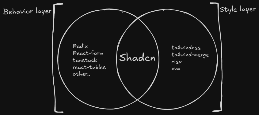
Behavioral layer
- This layer is made of headless components and it just focuses on behavior, functionality, state, properties and accessibility of the component.
- Radix-primitives is used for most of the components.
- React-form for the form components.
- react-tables for tables.
- And many more…
Style layer
- This layer decides how your components look and it's all about the visual presentation of a component. It can be customized however you wish to design it.
- Shadcn's style system is fully built with tailwind CSS, and some helping libraries for making variants and easier tailwind syntax.
- Shadcn has their own default theme and styles out of the box, and they also provide dark mode and light mode. You can make your own themes or just use the existing ones.
For deeper understanding you should definitely check this -